Thursday 16 September 2021

Opportunity: Initial problem

When I write about opportunity, what i mean is the initial problem definition, why are we here and what are we trying to solve? there are three main components to the opportunity stage


Identifying the opportunity for improvement is the first challenge of a design team, problems can come from many directions and usually are not as clear cut as they first seem; Often times symptoms masquerade as problems, for example I once worked with a client where it took 48 hours from the moment a user requested access to a system before it was either granted or the user was informed that they needed to take the appropriate training; after some investigation, the problem seemed to be a 48 hour service level agreement (SLA) with a 3rd party provider who was paid per ticket.

The provider was not willing to budge on the 48 hour SLA putting us at an impasse, but once we asked why is this handled by a service provider we started to gain some traction. We ended up cutting down a 48 hour turnaround time into a 10 second one by circumventing the service provider with a chatbot.

Now the above is a very simple example that nicely illustrates that the symptoms of a "slow" system  was actually the result of of an underlying problem of not having a dedicated admin that could handle the request, and that in fact this "admin" wasn't even necessary.

When we are trying to define our problem we should pursue questions along the following lines:
  • What is the actual problem underneath the symptom(s)?
    • is there a resolution?
      • what are the components of the resolution 
      • can the components be modified or reordered
  • Who is affected by the problem, 
    • our staff
    • our clients
    • our management
    • some of the above?
    • all of the above?
  • who has tried to solve this problem? 
    • Other teams? 
    • our competition? 
    • has anyone solved it 
    • has anyone moved towards a solution?
  • When did the problem start being a problem? 
    • this year?
    • this quarter? 
    • last week? 
    • why is it important now?
      • has it always been there?
      • has something changed that suddenly it's more serious? or just more visible?
        • has management changed
        • was someone managing the problem and no longer is
          • if yes, how? 
          • if no, why?
  • Has someone failed to solve this problem in the past
    • what can we learn from their failures
    • what did they do wrong
      • did they understand what the root cause was
  • where is this problem
    • local?
    • regional?
    • national?
    • global?
    • is it a cultural specific challenge?
  • Source of the problem
    • Internal
      • management
      • union
      • personnel
    • Partner
      • 3rd party provider
      • strategic alliance 
    • Competitor
      • Direct
      • Indirect
      • Disruptive tech
    • Government
      • Law
    • Cultural change
  • Why is it worth solving
    • enough impact to dedicate time and resources
    • will the solution be cheaper then the problem
      • in the long run
      • immediately 
      • does it matter (if it's legislation driven)
The most important thing is to dive deep, when investigation our problem, not to stop after the first level of questioning but to keep chipping away until we can get to the root cause, it's a very contextual approach, it's hard to say when you've gone deep enough. For my chat bot solution, the line of questioning that got us to our solution went something like this:
  1. Why does it take more than two days for new users to get anything done in this system?
    Because it takes up to 48 hours to gain access
  2. Why does it take 48 hours to gain access
    because it's a 3rd party provider that handles it for us on a ticket basis
  3. why do we use a 3rd party provider
    because its a rarely accessed system and it doesn't make sense to have a dedicated admin
  4. Is the system ours? or the 3rd parties?
    it's our internal system
  5. is there a rest API that we could use to access the system
    Yes.
The above is a very neat and tidy representation of what we did, in reality there where many dead ends we investigated many points of contact, many frustrations and many experts we had to consult, which brings me to my next point, just because our team has a technical component it doesn't mean it's the right technical component, when solving problems as a team you have to move beyond yourselves and consider solutions that you may not be well versed in. in those case you need ask yourselves:
  1. What expertise do we need?
  2. Who has the expertise that we need?
    • how much does it cost?
    • do we need external help?
One of the biggest challenges that we have to overcome is getting a handle on what the root cause of our challenge is, to make matters worse often times the client doesn't truly understand what's wrong:
  • The wrong problem being presented by the client
  • The wrong solution being presented by the client
in both cases it's easy to follow the wrong path, if the client pays you to solve the wrong problem or even worse they give you the solution to implement you are left in the worst possible situation where even if you are successful you still fail. If you solve the wrong problem 100% effectively you are still 100% wrong. 

Wednesday 1 September 2021

Introduction to design thinking

Design thinking in a nutshell is a set of techniques leveraged to figure out what the right problem is before solving it; this may sound superfluous however too often in today's world symptoms are confused with causes. For example poor user adoption is not a problem, it is the symptom of an underlying problem and design thinking asks and understands the most important question.


Design thinkers are merely trying to answer why is something the way it is, before trying to come up with a solution:
  • Why are we losing money? 
  • Why is no one using our service?
  • Why is no one buying our product ?
  • Why does something take so long?
  • Why is information not readily available? 
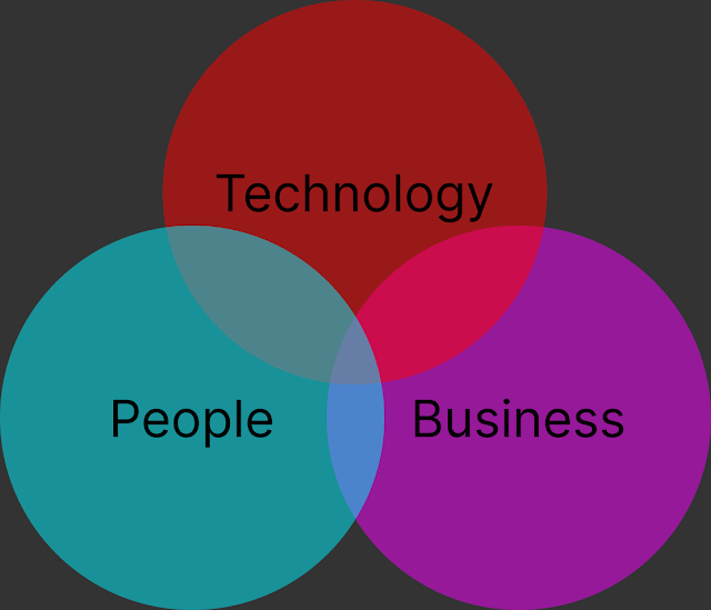
Design thinking is most effective in a cross functional domain that represents three main perspectives of the problem domain:
  • Business: this perspective keeps the solution aligned with organizational goals and within budgetary confines
  • People: not necessarily represented by actual users, but focused on understanding the users and their context.
  • Technology: provides an understanding of what is possible, what can actually be implemented to solve the problem


where these three perspectives overlap is the best opportunity for applying design thinking techniques resulting in innovation. The business is responsible to ensure viability, the user's perspective is to certify desirability and the technology delegate's goal is to align the solution with feasibility, when these three groups are satisfied we have a true contender.

States of design thinking:

Research:


  • Problem: this is the problem that has been presented to the Design team.
  • Investigate: the design team thoroughly investigates the problem.
  • Reframe: Once the team has investigated the problem, they have the knowledge and understanding reframe the problem into the root cause and not just the presenting symptoms.
The investigation of a problem revolves around the three cross functional domains:
  • Users: Gain an understanding into the end users and their context, how, where and why do they need this solution.
  • Business: How will this solution align with the business's strategic goals, which markets should this solution be distributed to, what type of revenue is required, what are compositors doing.
  • Technology: what resources are required for this product to be successful, is the technology feasible, is it readily available, 

Ideate:
The ideation state is generally what comes to mind when the words "Design thinking" are thrown about, this is the stage where the team comes up with creative solutions to the problem they're trying to solve.


  • Divergent: is the concept of coming up with ideas no matter how wild or unfeasible to solve the problem.
  • Convergent: narrowing down ideas to those that are feasible and best solve the problem
  • Visualization/storytelling: packaging these wild ideas in such a way that there value can be communicated with a greater audience 

Prototype:
The prototype state is where the team takes their best ideas and puts them to the test.


  • Prototype: build a model of part or all of an idea that the team wants to verify.
  • Test: create quantifiable criteria to measure prototypes against
  • Refine: synthesize results from prototype testing and incorporate lessons learned back into prototypes.

Prototypes should aim to answer questions like:
  • Does the solution really work the way it was intended? 
  • What do your users think of the solution, aesthetically, functionally? 

States of design thinking 


Design thinking moves between three states, in any order, generally you'd start with Research, but you could really head in any direction from there. Designing a solution involves many iterations between Research, Ideation, and prototyping as the team learns more about the problem from prototyping and/or ideating they need to revisit their problem definition do more research 


Our design team has to be comfortable with ambiguity, it needs to be made up of people that have various perspective but share one very important trait, and that's curiosity, these aren't people who want to be told what to do, they are people want to figure out what to do. People who are not afraid of sharing their ideas, who welcome challenge and criticism, people who are humble who don't mind sharing a "dumb" idea who aren't afraid of being wrong and who understand that sometimes the best solutions sprout from the dumbest ideas.

To truly embody the design thinking mindset one has to be part of a team where members can riff off each others ideas. To be able to work together in a constructive way to look at a problem holistically and iterate one their own as well as each others ideas. To have an open minded team spirited decentralized approach to problem solving, where everyone contributes and no one steals the show. Design thinking isn't about a superstar solving a problem it's about a team of passionate individuals drawing on each others expertise to identify problem and propose a holistic solution.

The Design team keeps the "User" at the center of their solution realizing that they are solving a business problem for a group of users leveraging technology.

the design process has three main bi-directional stages. the process is very iterative, we can identify our opportunity design our approach, go back rethink our opportunity then jump to our prototype, test it than redesign, prototype again and just move between the phases as needed to try and frame our problem and a solution that meets our main criteria.

In short Design thinking is a safe space for curious minds to come up with viable, novel, and desirable solutions.

Thursday 26 August 2021

What to look for in a user test

When conducting a user test it is important to know what to look for:
  • Where users able to complete the tasks asked of them? and WHY or WHY not 
  • Where users able to compete their tasks promptly and simply? and WHY or WHY NOT
  • Did users make mistakes? did they realize they made a mistake? could they recover from their mistake? Why did they make a mistake? Why did they realize it? 
  • How did users feel about the experience? and WHY did they feel that way?
the key question is why? when we are running a user test we want to know the root cause of a problem or a success we want to know why something works or doesn't work so that we avoid design pitfalls and move towards effective designs.

When conducting a user test we also want to capture information during the test

Qualitative Data
Critical incidents: things that happened during the test that may explain the results
Verbal account: Statements made by the user that indicate the thought process, attitude, and explanations of the user

Quantitative Data
Time to complete a task
Success rate of task

Critical incidents: are the bread and butter of user testing, they include any action taken by the user that explains why they where or where not successful at a task, they can include things like:
  • Clicking the wrong button
  • Ignoring the instruction shown on the screen
  • Providing the wrong information
  • Following the wrong path
  • misinterpreting a label
  • expressing confusion or frustration 
  • asking for help
  • staring at the screen for a long time
  • giving up
Verbal accounts: are just the things that users say while performing tests, they can provide insights into what's going on inside the users head while performing the test, they can say things like:
  • I"m looking for
  • I was expecting to see
  • i wonder what this does
  • Well that doesn't seem right\
  • I think that was right
  • ask a question 
these types of qualitative data are essential for us to establish actionable intelligence that is information that we can leverage to fix a problem, for example quantitative data could be something like 40% of users failed at "Task A", but qualitative data would be "2 out of 5 users could't figure out how to fill in their shipping info resulting in a failure of task A", an even better result would be to link your qualitative data back to a heuristic guidelines.

Data about users
Not only should you collect data about the test, how it went, what the users did or thought but also information about the users themselves; things that will provide better insight into the users being tested. things like:
  • Technical competence:familiarity with computing or with the particular platform, IOS vs Android vs Windows or Mobile vs Desktop 
  • Domain Expertise: if they are familiar with this particular domain, if it's a social media app; do they use social medai, if it's a shopping site do they do online shopping
  • how frequently do they partake in this behavior 
  • general demographics
    • Age
    • gender
    • Education
    • Ethnicity 
the goal of collecting data about our users is to better understand the whys? why a certain group of users failed a specific task; most often the deciding factors will be technical competence and domain expertise.


Saturday 21 August 2021

Formative Tests

Formative tests are performed to identify problems that need to be fixed, they are far more common than Summative tests. where summative tests focus on quantitative data such as 90% of users where able to complete "Task A" in under 30 seconds. Formative focus on qualitative analysis of problems such as:

  • Users struggled to accomplish "Task A" because the button required failed to convey the information that it was a button.
  • Users failed to took too long to complete "Task B" because the the information required wasn't readily available and they had to go searching for it.
Formative tests are the most common type of test leveraged in UX research and design. Formative tests are performed during the design phase with the goal of identifying "Bugs" to fix.

General procedure
  1. Have representative users perform tasks
  2. Observe them, what they do, what they say
  3. capture where they struggle
  4. Identify parts of the design that cause problems

Summative tests Formative tests
Users perform tasks
Representitive users
Prove a point Find a problem
Quantitative Qualitative
Many users Few users
Rare Common

Monday 16 August 2021

Summative tests

Comparative summative tests: to determine if a new design is better than a legacy one, or compare two new designs, ones we designed or ours to a competitors to see which one is better suited.

it is important to demonstrate using metrics that one design is superior to the other:
  • 30% more users completed tasks A,B and C using interface 1 vs's interface 2.
  • users completed tasks 45 seconds faster using interface 1 vs's interface 2.
  • errors where reduced by 25% using interface 1 vs's interface 2
tests are conducted with the same types of users, but not the same users.  once compete a comparison is conducted with regards to the differences in performance based on interface; it goes without saying that the more times you run a test with the greater number of users, the more reliable your results are.

High level Procedure:
  1. Hypothesis: make and educated guess as to the results of your experiment
  2. Control group: compare one group to another
  3. Only interfaces should vary, user types should be the same (not the same users, but the same profile of users); Tasks to complete, data in the system should also be consistent across the interfaces being tested.
  4. Use statistical comparisons to demonstrate results, t-test, chi-squared, ANOVA, put some numbers to your claims.
Benchmark summative tests: are used to answer the question of whether or not our interface meets a performance requirement, for example that users can create an online profile in 30s and start using the system or 95% of users tested succeeded at accomplishing "task d" or users make errors less than 5% of the time.

The benchmark summative test is most appropriate when
"Hard task constraints" (eg task must be completed in x amount of time); a perfect example would be a automated kiosk at an airport.
there are defined targets: operators must process a product in less then 30 seconds. with a 1% margin of error.

benchmark summative tests are often appropriate for performance critical domains, such as healthcare or military

High level Procedure:

  1. Test users performing tasks using design
  2. capture the performance of the tasks being completed, accuracy, speed, success rate
  3. Demonstrates that metrics captured meet defined criteria 
  4. Use statistical methods to to calculate confidence interval
  5. again since you'r using statistical analysis you really need to test a large number of users to get a good level of confidence in your results
Take aways
Summarative tests are used to determine that a design is better or good enough; they are used to summarize a characteristic about a design and want to make a claim about; your claim is supported by statistical data, summarative tests are rare in User research because the background in statistics that's required. as well as the increased number of users required.
Summative tests Formative tests
Users perform tasks
Representitive users
Prove a point Find a problem
Quantitative Qualitative
Many users Few users
Rare Common

Wednesday 11 August 2021

Heuristic Evaluation

Heuristic Evaluation is poor mans UX inspection method, it's cheaper & faster then usability testing, it also doesn't require users which why it's cheaper & faster. It's an inspection method, you go through the interface and apply Nelsen's 10 Heuristics
  1. Visibility of system status
  2. Match between system & real world
  3. User Control & Freedom
  4. Consistency & Standards 
  5. Error Prevention
  6. Recognition instead of Recall
  7. Flexibility & efficiency of use
  8. Aesthetic & minimalist design
  9. Help user recognize, Diagnose, and recover from errors
  10. Help & documentation
Heuristic Evaluation Technique 
  • Select system or set of screens to evaluate
  • Step through the user journey and apply heuristics to potential problems
    • Be sure to test error case
    • Be sure to test help system
  • Write down all violations big or small 
    • Which heuristic they violate
    • Asses the severity of each violation
      1. Cosmetic problem: no real user experience impact
      2. Minor usability issue: Fix if there's time
      3. Major usability issue: Important to fix
      4. Usability Catastrophe: must be fixed
  • Create prioritized list of violations
    • Highlight top 5 to 10 violations
    • Rank in descending order of severity 
    • Use heuristics to explain importance
Describing a heuristic Violation
Description: Drop down list is not identified as such be inspection
Severity 2/4: Minor issue
Heuristic Violated: Recognition instead of Recall
Summary: the user should be able to identify that the "All Tasks" filter is a drop down with out having to remember to click on it.

Screenshot

Recommendation: Add a downward arrow to the right of the selected value indicating that it's a drop down menu.

having 3 to 5 experts evaluate a system individually then pool their findings is one of the most effective ways to identify a large share of violations 

Heuristic EvaluationUser Testing
  • Cheap
  • Fast
  • Doesn't require users
  • More Realistic
  • Finds more problems
  • Asses other UX qualities beyond Usability

It's normal to use multiple techniques in an iterative process to flush out all usability issues from your system

Summary
  • Heuristic evaluation is a quick and cheap way to identify significant flaws in a user interface
  • leverages Nielsen's heuristics 
  • Inspect each screen, potential errors, and help options
  • capture and asses violations
  • prioritize 


Tuesday 10 August 2021

Jakob Nielsen's 10 Heuristics

  1. Visibility of system status: the system should always keep the user informed of what is going on within a reasonable amount of time using progress indicators or busy signals.
    • if an action will take less then 100 milliseconds it's instantaneous 
    • if an action takes a second it's noticeable but acceptable
    • if an action takes less then 10 seconds it requires a notification that something is happening
    • if an action takes more then 10 seconds it should be done in the background, with indicators and estimates
  2. Match between system and the real world: the system should leverage real world language that is familiar to the user rather the system jargon. follow real world paradigms making information appear in a natural and logical order.
    • Takes advantage or users schema
    • Align real world actions with digital ones
    • processes should just make sense.
  3. User control and freedom: Users often choose system functions by mistake and will need a clearly marked "Emergency Exit" to leave the unwanted state without having to got through an extended dialogue. Support undo and redo.
    • Support 7 stages of action, perhaps user wants to try approach again but with deviation.
    • Users employ trial and error approach to figure out how to use new system.
  4. Consistency & Standards: users should not have to wonder whether different words, situations, or actions mean the same thing. Follow platform conventions
    • helps users transfer schema knowledge from one part of the system to another.
    • coherent conceptual modal helps user learn system effectively.
    • use the same term in the same what through system, don't use search and then find
    • by staying consistent you help users more rapidly learn new systems by following paradigms they're already familiar with.
  5. Error prevention: Even better the good error messages is a careful design which prevents a problem from occurring in the first place. Either eliminate error-prone conditions or check for them and present the user with a confirmation option before they commit to the action.
    • in-process feedback, give the user feedback before they submit, ie invalid email
    • provide constraints, keep user from making mistakes by asking for input very specifically.
    • confirm if the user is trying to accomplish something dangerous like delete all files
    • prevent users from actions that are likely to fail
  6. Recognition over recall: Minimize the user's memory load by making objects, actions, and options visible. The user should not have to remember information from one part of the dialogue to another. Instructions for use of the system should be visible or easily retrievable whenever appropriate.
    • try to use recognition over recall
    • is it reasonable for users to have to recall something
    • if recall fails are there cues to help 
  7. Flexibility and efficiency of use: Accelerators, unseen by the novice user may often speed up the interaction for the expert user such that the system can cater to both inexperienced and experienced users. Allow to tailor frequent actions.
    • recall for new or inexperienced users is very difficult whereas recall for veteran users is not a problem and both types of user need to be catered to.
    • allow users to customize their experience but don't force them to
    • accelerators are things like keyboard short cuts
    • allow users to create bookmarks and shortcuts
    • personalization tailors experiences based on past usage
  8. Aesthetic and minimalist design: dialogs should not contain information that is not relevant or is rarely needed. every extra unit of information in a dialog competes with the relevant units of information and diminishes their relative visibility.
    • Visual clutter makes it difficult to focus on important actions
    • good use of color, share, animation and gestalt principles guide the eye
    • the more there is to look at the less the user will see.
  9. Help users recognize, diagnose and resolve errors: error messages should be expressed in plain language (no codes), precisly indicate the problem, and constructivly suggest a solution.
    • good error messages will explain what the user did wrong and how to fix it.
  10. Help and documentation: Event though it's better if the system can be used without documentation, it may be necessary to provide help and documentation. Any such information should be easy to search, focused on the user's task, list concrete steps to be carried out and not be too large.
    • sometimes the UI just isn't intuitive enough
    • best if help is not needed
    • if required make sure that
      • help is searchable 
      • task-focused
      • concrete 

these 10 rules of thumb are in place to help design a system that is a pleasure to use

Thursday 5 August 2021

Micro Usability testing

A usability test is a formalized test in which participants are drawn from the target audience, to use pragmatic approach early on we can leverage a "Micro Usability test" this is a scaled back version of a user test:
  • Users can be "Close Enough" to the target audience (whoever is willing and able)
  • Fewer tasks (2 to 3 tasks) closer to 15 to 20 minutes instead of (5 to 10 tasks) 1hr to 1.5hrs
  • No screen recording of user actions
  • No video recording of user
  • No logging of user actions
  • No questionnaires regarding users persona 
The goal is to just capture the 2 to 3 biggest takeaways from the micro usability test, there's no need for correlating the data and doing a in-depth analyses of the what why's and how's

When conducting a micro usability test you want to come up with 2 to 3 tasks:
  • each task should be presented to the participant separate from the other tasks
  • order the tasks from easiest to hardest
  • the tasks should be clear concise
  • tasks should have a clear and defined solution
  • When completing the tasks the user should use the "Speak out loud" technique
  • and when they think they're complete the user should notify the tester
once all the tasks are complete, or the user gives up this is the time for the debrief, this is the testers opportunity to engage with the tester and ask them:
during this point you seemed "surprised", "frustrated", "confused"; could you tell me why, what was wrong with the system. etc it's your opportunity to really investigate and find out what the user was thinking or feeling.

after your ad-hoc investigation you should ask some predefined questions for general feedback
  • have you ever used a product like this? why or why not?
  • do you see yourself using something like this why or why not?
  • some questions that are particular to what your testing.
Once the test is run and the test and post test data is collected, well its time to compile it all into a micro usability test report. The report should consist of 3 sections:

1) Key observations
A few paragraphs about key observations throughout the test
  • Describe the participants, write a persona (Who they are, what kind of experience do they have, with similar systems and with technology over all)
  • How the test went overall
  • Success rate of tasks
  • Partial or complete failures of tasks
2) Problems
Focus on the top 3 to 5 biggest problems observed and diagnose the cause of those problems, things to focus on:

  • What worked well? What didn’t? 
  • What were the most confusing or frustrating aspects of the interface? 
  • What errors or misunderstandings occurred? 
  • What did users think about the interface? 
  • What would they like to see improved?
3) Recommendations 
list the main issues that where brought to light and back them up with evidence from the test, and propose recommendations as to how to rectify the problems.

Sunday 1 August 2021

User Testing

User testing also known as "Usability testing" is one of the main methods used for user testing, at it's core it's basically giving a user a task to accomplish within the system and observing the user try to accomplish that goal. By observing users work with a system you learn

  • What works and what doesn't 
  • Why things work and why some don't
  • User needs you missed or misunderstood

the basic flow for running a "user test" is

  1. Find potential users
    • When picking users, make sure to select ones that are the target audience
    • Pick users that are not current users
  2. Give them tasks to complete within the system
    • Selecting taks is for users to try is much more difficult then it seems
    • Start with the most common tasks
    • Move on to less frequent tasks, focus on the most common tasks and move in decending order
    • Closed ended tasks, 
      • ones that have a clear and defined point of completion
      • have a verifiable outcome
      • follow a predictive path
    • Open ended tasks
      • Are more natural 
      • difficult to asses success because of ambiguity
      • explore paths that may not have been identified
    • Use both open and closed ended tasks.
  3. Observe them compete their tasks
  4. Debrief them after they've successfully or unsuccessfully completed their tasks
  5. Document what you've learned

we do this as part of our assessment iteration so that we can redesign our system to work better.

When selecting our task sets some things to keep in mind are

  • order form easiest to hardest
  • focus on critical tasks the things the system must accomplish
  • should include both "open" and "closed" ended tasks
  • avoid ordering affect: giving a user the answer to a subsequent task in the current one
  • don't lead the user: avoid language that will diverge how to accomplish the tasks
  • avoid ambiguous instructions: when defining you task be specific enough that the user will understand clearly what you want them to do and how, but without leading them.
  • tell the user to indicate that they feel they've completed the task
  • pilot the tasks
    • check the task yourself and have some colleagues try them out to ensure that they meet the above criteria 
Think out loud 
  • participants verbalize out loud what they are thinking as they're accomplishing their tasks:
  • looking for something  
  • reading text
  • hypothesizing how the system might work
  • interpreting system options
  • interpreting system feedback
  • explaining their decisions 
  • feelings: frustrated, happy, etc

it's not normal for users to do this "Think out loud" process, so don't hesitate to remind users that you're interested in how the feel or what they're thinking, use positive reinforcement to coax their thoughts and opinions out.

advantages of this approach are:

  • hear how the user thinks about they task 
  • learn what the user actually sees and notices 
  • hear how the user interprets options and feedback

disadvantages of this approach are:

  • timing: since users are vocalizing what they're doing they wont zip through the system as quickly as the might otherwise
  • Attention to detail: since users are vocalizing and paying more attention to what they're doing they may notice things that otherwise would be overlooked. 
  • users will naturally ask questions, but as the observer you are not suppose to answer them
Post user test (debriefing)
once the user test is complete you can:
  • Review the users problems to try and get more information out of the user
  • ask the user if they find this product useful, if it's something they see themselves using 
  • ask if it was usable, credible, aesthetically good looking 
  • compare it to existing alternatives 
What have you learned?
after you've run your tests and completed you debriefing it's time to summarize your finding, what you should focus on are the critical incidents
  • errors: where users didn't follow the correct path expected didn't do what was expected
  • expressions of frustration: users got stuck, seemed confused as how to proceed 
  • breakdowns: where simple tasks took a long time, or users detoured from the defined journey but still got to where they where suppose to
  • pleasant surprises: things that the user enjoyed, things that where easier then expected
Assess if the user failed or succeeded and to what degree? Capture the users demeanor, where they happy with they system or do they think it's a load of bullocks. most importantly capture as much objective and subjective data as soon as possible, ideally during the test, debrief and directly after. Write down all the critical incidents you can:
  • Mental modal mismatches 
  • Misinterpretations
  • Invalid assumptions made by the system
  • Missing user needs
  • Too little flexibility 
  • Too little guidance 
while summarizing your results you really want to capture overall reactions to specific aspects of the system and link those with the users successes and failures. 

Saturday 10 July 2021

Prototyping: input & output

"Prototyping translates findings from formative work into concrete designs that can be tested, revised and refined prior to implementation of the final system."

Basically it's taking everything we've learned from our research bringing it together to build a proof of concept, the prototype doesn't have to be a fully working end to end solution but one or a series of targeted POC's that can be shared and played with. The idea is to collect more information get more feedback and use that high value data to improve the solution.

Prototypes do not even have to be coded, they can be made of paper or a series of screens they are a medium to convey a more refined concept than just wires or screens.

When designing a system we can really think of our solutions as something that process input into output, input being what we provide to the system, output being what the system provides to us; there are other factors like data retention, but for simplicity sake let's focus on Input->Process->Output.

"Input: Data that needs to be entered into the program to enable it to perform a desired tasks"

As designers we need to understand what data needs to be entered into the system and what the most effective way to enter that data is. There are two basic types of data

  • User defined input: input that is directly entered by the user via, textboxs, buttons, menus, date pickers, voice input, file upload, etc . input that is actively entered via UI controls.
  • Passive data: input from background sensors such as location services, accelerometer, fitbit, picture library, rss readers, anything the user doesn't actively enter but is available.
When performing interaction design there are some basic questions that need to be asked
  1. What is the granularity of data input that is required? 
    • Do you really need first name, middle name, last name, or would just name suffice.
  2. When and how often is the data needed?
    • Ask for the minimum amount of input upfront then passively or progressively collect subsequent user input.
  3. What is the state of the user when the data is required, is the user driving? eating? in a distracting environment? sitting in front of a computer on their lunch break? 
    • the users state is key in deciding what kind of inputs are going to be effective
  4. What is the value vs burden relationship of obtaining the data?
    • Will the user be willing to supply the input to receive the output, if all i want is to know the exchange rate of Swiss francs to US dollars, am i willing to input more then just the value to be converted? how much battery life must we drain? what are the privacy implications? is the user willing to pay the battery life or privacy cost
Effective interaction design is fundamental to successful technology design, if users can't or aren't willing to provide the input required for the system it will fail. It is important to strike a balance between the effort to supply input and the value of the output.

Output is the information that the system presents to the user once it has processed the user's input. it can broadly be defined as:

"Output: Information that the system presents to the user in order to accomplish its intended function"

Output is made up of:
  • Structure: The format in which information is presented to the user.
  • Content:What information is presented to the user. 
when the output is presented to the user there are considerations that must be taken into account to best decide what structure to utilize when presenting the output to the user.
  1. What exactly does the user need to know to perform the task?
    • What is the user trying to accomplish, what information does the solution provide to support the user's needs.
  2. When/how often will the user interact with the information?
    • Does the user need the information weekly? daily? hourly? 
  3. In what state will the user be when presented with the output data?
    • will the user be driving? sitting at a computer? working in the field?
  4. What is the users current knowledge base?
    • Does the user have the expertise to understand the output.
Pull vs push content
Traditionally when users interact with a system they are presented with pull content, that is content that they request and are supplied with. However push content is delivered to the user based on predefined rules, the user receives the content when the system is programmed to provide it; this content needs to be simple and unobtrusive.

UX design involves designing inputs, outputs and the rules that translate the inputs into value added output for the user. When, where, and how the user will interact with both the inputs and outputs of a system must be considered for successful interaction design. The system must also convey why the solution is behaving the way it is, the user should know what value their input is providing; users' are far more likely to provide input or allow access to input if they see the value it will produce for them.

Monday 5 July 2021

Prototyping

"Interaction design prototype is a representation of a design, made before the final solution exists"

the reason behind prototyping is that even after all of the formative work during UX research and creation of personas, wireframs, scenarios, and storyboards there often still isn't enough granular detail to really create an effective solution. Prototyping aims to bring everything together pragmatically and answer all the missing questions while keeping all the value added results form our research in mind.

A prototype aims to mitigate to major risks when building a system:

  1. How exactly should the solution work, going from broad strokes to fine edges
  2. Mitigate the cost of engineering and software development by
By building a prototype before beginning true development you can flush out a majority of the challenges that will be faced by the development team before they're faced with them. Prototyping enables testing and collecting feedback on:
  • Overall design concept
  • Functionality of different components of the system
  • User interactions
  • Layouts
  • Fine-grain design details such as fonts and color schemes
"Each prototype is intended to answer one ore more questions intended to help designers make decisions that move the design forward"

Types of Prototypes 
  • Storyboards: a sequence of frames depicting a visual story with descriptions providing context of use. they act as both a representation of the formative work as well as prototype in the sense that they allow the extraction of feedback about a concept as well as context of use.
  • Sketches: Visual ideation around different approaches and options. Also used for early feedback to validate ideas and approaches to solving problems.
  • Wireframes: Visual representations of an individual screen or view of a system. they are used to identify what type of input and output is collected and displayed as under what conditions. Used to map out a high level understanding of the system, not a polished product.
  • Interactive prototype: captures multiple states of a design, transitions, interactions, look & feel.
prototyping maximizes the number of times a solution can be revised and refined before it is committed to code.

Thursday 1 July 2021

Prototypes

A prototype is a representation of a design before the final solution is decided upon, that is a prototype is a living representation of our idea and as our idea evolves to meet our challenges so does our prototype. Sometimes we drop our prototype and start fresh but we should always learn something from our prototypes, if not what works then definitely what doesn't and with these lessons we improve or build new prototypes that get us closer to a resolution or solve our problem becoming our finished product.

Reasons for prototyping 

  • Reification: is the process of taking an idea or concept and making it real, by creating our prototypes we create the opportunity to verify our ideas are going to resolve our problems.
  • Reflection: by createing a prototype it gives us a chance to reflect on our design to ensure that they are meeting the design goal or taking us in a different direction
  • Communication: Prototypes communicate our design ideas to the stakeholders to validate that our solution is going to solve the right problem.
  • Assessment: allow us to run user tests on our ideas to verify that they are going to satisfy user needs.
Various forms of a prototype
  • Verbal description
  • sketch or wireframe
  • storyboard
  • Navigation/flow diagram 
  • Physical model
  • Video
  • Formal specifications 
any of the above are valid prototypes however in user experience we usually mean a depiction of the system as a user will experience it. there are vaious levels of prototype
  • Low-fidelity
    • Addresses
      • Functionality of what needs to be done
      • Organization of how the UI is going to look, grouping
      • Task flow & Coverage: Solve the tasks users need and how many of them
    • Ignores
      • Graphics: colors, fonts
      • Programming: no programming done on paper to keep costs down
      • Real Data: don't wory about actual data
  • Mid-fidelity
    • Addresses
      • Layout: how are the fields and controls going to be layed out
      • Interactivity: How does it feel to interact with the system 
      • Navigation: from one part of the system to another 
    • Ignores
      • Graphics: colors, fonts
      • Programming: no programming done on paper to keep costs down
      • Real Data: don't wory about actual data
  • High-fidelity
    • Addresses
      • Graphic design: colors, fonts, images
      • Interaction details: animations, transitions
      • Realistic data: actual data for system 
    • Ignores 
      • Background programming: services, security, etc
      • Complete functionality coverage: focused on task trying to resolve 
KISS (Keep it simple stupid)
The best prototype communicates the design idea in the simplest most economical way possible to the stakeholders or the team, the idea to prototype to most minimal level is to save time and money to let the needs of the product guide the design and not the prototype fashion the needs.

Low-fidelity prototypes will also receive more open and honest feedback, stakeholders are more likely to challenge a design when it's on paper than if significant resources where put into constructing it.

the iterative design process

Assess Design Build Assess
  • Asses current needs
  • Understanding
    current problem
  • Establish guidelines
    & constraints
  • Personas, scenarios,
    user stories,
    requirements   
  • Ideation
  • Sketching
  • Selection
  • Synthesis 
  • Develop
    Prototype 
  • Assessment
  • redesign
  • More
    prototyping 
Sketching 
sketching is one of if not the most valuable tool in a UI/UX professionals box, sketching allows designers to workout problems quickly and cheaply. sketches have the following characteristics 
  • Quick: to produce
  • Timely: can be inserted in multiple ways
  • inexpensive: cost is low
  • disposable: you're not committed to them
  • plentiful: you can make dozens if not more
  • minimal: very little detail 
  • ambiguity: let you evolve them
sketching is an activity it is central to the design process, it is not just the product of sketching it is also the process, it gives us an opportunity to: 
  • reflect on our designs 
  • explore directions they may lead
  • communicate our ideas
What to sketch?
Problem: sketching what's wrong gives insight to what we are trying to solve
Resolution: what would it look like for the problem to be solved 
System: to solve the problem


Sketch Prototype
Evocative Didactic: try to explain
Suggest: possibilities & opportunities  Describe: a paticular idea 
Explore: ideas Refine: initial explorations
Question: raise questions about solution Answer: try to answer questions
Propose: ideas Test: ideas
Provoke: ideas push boundaries Resolve: problems
Tentative: possibilities  Specific: testing potential solution
Noncommittal: no investment  Depiction: committing idea for testing

Sketches are used for generating ideas and creating options whereas prototyping is narrowing down ideas for problem resolution. sketching is used to come up with ideas and strategies whereas prototyping is used to narrow those ideas down to the ones that work best.

when sketching it's very common to get stuck, where as there are many ways to try and get unstuck there is one simple method known as "The worst idea" this is the processes of sketching the worst solution to your problem, the idea is that by understanding what not to do it may give you new insight on what to do.

Sunday 20 June 2021

Models: Mental, Conceptual and Interaction

A mental model is the way a person understands the world around them. You have a mental model of wooden blocks and you have a mental model of your oven, it's just the way your mind understands the way that something works. Your understanding by no means has to be correct or aligned with the intended use; for example I have a charcoal BBQ that I burn firewood inside of in the autumn to use it as a space heater for my patio. My use of the BBQ isn't exactly aligned with the intended use, but my mental model of it has expanded beyond just grilling food.

A key part of solving a UX challenge is to define a mental model that is appropriate for what is being designed, mental models are created early, and evolve quickly they are by no means, written in stone and should grow as you get a fuller understanding of the problem domain.

Six consideration to keep in mind when planning/analyzing a mental model are:

  • Appearance: the way the system appears it should be used.
  • Familiarity: does the system use design axioms and established design patterns?
  • Simplicity: the ease of use, can a new user figure it out through trial and error
  • Recall: procedural knowledge, recognizable sequences vs declarative knowledge facts
  • Flexibility: the ability to do things in any sequence.
  • Feedback: does the system provided positive and negative feedback appropriately.
mental models can be represented by flows or user journeys, they need to communicate why the user is trying to use the system

Once a mental model is constructed or understood then that insight can be used to create a conceptual model. A conceptual model is the bridge between how the user thinks the system works and how it generally functions. for a conceptual model you can start thinking how you are going to facilitate the mental model. these can take the form of wire frames
Conceptual models should describe what the user is trying to do

When the conceptual model is established then it's time to start experimenting with interaction models; these are more defined representations of how our system should work, however these are experiments. They can prove to be successful or be failures, think of them as tests to see if your approach is valid, this is not an end product of a process but merely step in an iterative process.
these can take the form of prototypes.
and interaction models should demonstrate how the system is going to help the user accomplish what they want to do.

Tuesday 15 June 2021

Design Rational

Design rational is the process of justifying a designers choice from their options; the euphemism "There's more than one way to skin a cat" holds very true for UX design. Oftentimes when solving a UX challenge the designer has numerous options, the trick is to pick the best one for this particular instance of this problem.

"Design rational is the articulation of various trade-offs between potential options to guide design towards the most optimal solution."

Design rational aims to understand the various options in terms of their various pros and cons and then justify the decision to pursue one particular design route over the alternatives. there are many pragmatic and theoretical approaches to selecting a design route, almost all of them are based on the articulation of design trade-offs and using those trade-offs to make a decision.

Questions, Options, and Criteria.
QOC is a methodology to facilitate systematic and principled decision making for design options. It's routed in the notion that

"A feature is represented by multiple options, which answer a particular question. Criteria help articulate the various tradeoffs between the options and guide the choice of which option to settle on."

Questions:

  • Provide structure to the design space
  • Help uncover and define design alternatives

Options:

  • Are different potential solutions to the same question

Criteria

  • The required and desired properties that a solution should satisfy 
  • Differ in importance and generality 
  • Help determine reasons for a decision
Criteria do not just come out of thin air, they are founded in requirements and often come from:
  • UX research, the formative work that is done with target users
  • Requirements gathering both functional and non functional
  • Accessibility constraints: visually impaired, hands free for driving, etc 
  • Usability: integration into daily routines, Privacy, social acceptability, etc
  • Previous studies: historically identify what works, established paradigms  
  • Behavioral theory: how do people act vs how they portray/believe they act
  • Common sense.
where ever your criteria come from it's important to understand they are not arbitrary and are in fact rooted in a need, when a criteria is proposed ask why? if you can't come up with a good answer then you should rethink the criteria.

By listing all of the criteria required 

Thursday 10 June 2021

How Humans Perceive

There are five main senses that human beings use to take in information
  • Sight
  • Sound
  • Touch
  • Taste
  • Smell
In graphical user interfaces we mostly leverage sight, in User experience we can also incorporate sound, and in some systems we can even leverage touch; as for taste and smell, well maybe in the future; however we are going to focus on sight since most UI information is conveyed visually. humans have a very narrow field of view, we most of what our brain perceives is peripheral vision, we can only really focus on about 5 degrees of information at a time.

This 5 degrees of vision is the reason we have to scan things before we identify what we are looking at, our brains do this automatically. When designing an interface we have to be aware that just because we put something on the interface doesn't' mean our users will ever look at it. studies have show that when users read a web page they follow an "F" pattern, that is the read the top line, maybe the second or third one, and they scan the left side of the page for information.

By being aware about the F pattern we now can identify where the best real estate on a page is to increase the odds of your user finding what you're trying to sow them.

Our human eyes are better at differentiating UI assets by their properties:
  • Color: if something has a contrasting color our eye will almost certainly notice it
  • Shape: not as stand out as a color change, but our eyes will catch objects that are of a different shape
  • Clutter: is all the things distracting the user from finding what they're looking for, if there's too much clutter and we don't differentiate our search target from the clutter we have to manually search, scanning our UI the way you do a word search.
  • Motion: if we add some sort of animation to our UI this will again draw our eye to our search target.
the Gestalt Principles are a set of principles that define patterns that humans see:
  1. Proximity: objects or shapes that are close to one another appear to form groups. Even if the shapes, sizes, and objects are radically different, they will appear as a group if they are close together.
  2. Similarity: we group things that look similar into categories, for example a group of triangles
  3. Closure & Continuation: refers to the way that a dashed line is still perceived as a line even though it's not a continuation our mind sees it as one item. same with a dotted border.
  4. Symmetry: we are far more likely to perceive symmetrical half's as part of a whole than two different objects overlapping each other.
  5. Common area: things that are grouped inside of a border we them as being related.
  6. Common fate: if visual elements are seen as moving in the same direction at the same rate (optical flow), our perception associates the movement as part of the same group
Take away
  • we can use pop out, things like Color, shape, and motion to draw attention to things to make them pop-out from the other clutter.
  • we can use the six Gestalt Principles to group things together
  • and we can use the same gestalt principles to allow people to skip over sections to find what they're looking for


Saturday 5 June 2021

7 stages of action

In the book the design of everyday things, the author Donald A. Norman modals how people act when they are pursuing a goal. this modal has seven stages:

  1. Forming a goal: decide on something you want to accomplish 
  2. Forming the intention: decide if you want to pursue your goal
  3. Selecting the action: pick the "best" thing to do to accomplish your goal
  4. Executing the action: do the "best" thing you chose to do to accomplish your goal
  5. Perceive the state of the world: take in the information of the result of the "best" thing you chose to do
  6. Interpret the state of the world: use the information you gained to see how your "best" action changed the world
  7. evaluate the world: decide if your action accomplished your goal, moved you closer to your goal, or further from your goal.
this is an iterative process that people follow to complete their minor goals to reach their major goal


if you look at the first three steps after forming the goal:
  1. Form the intention
  2. Select the action
  3. Execute the action
they make up the Execution path, deciding to act, selecting the action and performing the action. Whereas the following three steps:
  1. Perceive the result
  2. Interpret the result
  3. Evaluate the result
make up the Evaluation path, seeing what changed, interpreting it, deciding if the change moved the user closer to his or her goal.

the space between the user's goal and the execution path is referred to as "The gulf of Execution" the challenge for the user to map their goals on the possibilities in their environment, whereas on the other hand the user faces "The gulf of Evaluation" this occurs when the user tries to see what their action changed, interpret their change, and decide if their change moved them closer to their goal.

When designing systems we want to bridge these two gulfs, the gulf of execution and the gulf of evaluation. To bridge the Gulf of execution we want to make it clear and obvious for the user as to what they're suppose to do, and as for the gulf of evaluation we want to give them a clear indication via feedback that their action has been received and is moving them towards or away from their goal in order for the user to keep on their present course or pivot to move towards their goal.

Users need to be able to know what the system can do, how to do it.

The Gulf of execution: Users can figure out what they can do
The Gulf of evaluation: Users can see if they where successful 

Aids in discovery 
  • Affordances: a feature of an object or environment that indicates the possibility of action, it'll communicate that something can be done intuitivly  
  • Signifiers: an indication of what will occur and where it can occur. Signifiers are often required when you have many options but you need to differentiate them.
  • Feedback: lets the user know that their input was recieved and what it did with that input
  • Constraints: limit the number of options the user has, things the user can't do should be disabled or hidden. Limit the number of options making the selection easier.
  • Conceptual Models: support future actions, they are paradigms that will clearly communicate to a user what their action will accomplish, they are supported by the previous aids.
a designers conceptual modal is how the system functions and can be used, however every system is clear and obvious to the designer, the user however can really only use their past experiences and the visual cues available to form their course of action to accomplish a goal

there are two more aids that can be leveraged for building a Cohesive Conceptual modal:
  • Consistency: things should work the same way throughout the user experience
  • Metaphor:  things should function the same way between different user experiences, that is if a paradigm has been defined for example 3 horizontal bars for a hamburger menu, that's exactuly what your experience should do

UX Design

"Most people make the mistake of thinking design is what it looks like. People think it’s this veneer – that the designers are handed this box and told, ‘Make it look good!’ That’s not what we think design is. It’s not just what it looks like and feels like. Design is how it works." – Steve Jobs

Design is not an afterthought, good design begins with the inception of the product or service and is in the forefront throughout the entire delivery process. The product or service is the direct result of the design, too often in the past products are built and then designed, a vernier thrown onto a product is not a design, it's a face-lift at best.

Design is not what it looks and feels like, design is how it works. A Design is a plan to arrange elements to fulfill a purpose, it describes on how a product or service works, design is solving a problem.

Design Process
To successfully design something we must
  • Assess
    • Identify & understand the problems we are solving
    • what the user is doing what works what doesn't 
  • Design
    • Generate possible solutions to our problem
    • Analyse the solutions and select the best one
  • Build
    • Low/Mid/High-fidelity prototypes
this is an iterative process we go through numerous times until we arrive at an iteration that solves our problems.

What makes UX Design special?
When designing User experiences we are focused on experiences and interactions with the system, these are time sensitive inputs with feedback that the user interacts with for the purpose of accomplishing whatever it is the user is trying to do, this person could be a novice, or seasoned user and our system must engage with both facilitating their tasks as effectively and pleasantly as possible.

UX Design UX Research
Understand the problem Study Users: Tasks, context
Generate Possible solutions Sketch, storyboard, wireframes
Analyse & Select Apply UX criteria
Embody solutions Build prototype
assess:find new problems Apply UX research methods
user tests
Repeat!!!

UX Design works hand in hand with UX research we move between the two to try and come up with the best experience and interface that we can for the particular system we're designing.

Thursday 20 May 2021

Storyboards

A story board is basically a visual depiction of a scenario.

"A storyboard is a series of sketched frames that visually depict how and under what circumstances; environmental and emotional does a user engage with the solution being developed."

if story boards are just scenarios drawn out, then why make them? Storyboards provide a few important advantages over scenarios:
  • Better visualization of environment, a picture is worth a thousand words
  • Visualize physical constraints, size of space, setting
  • Depict users motivation and emotion
  • Visualize interactions between multiple users.
Elements of a Storyboard

  • Zoom: how wide/narrow is the focus of the frame, on the device on the user, the environment
  • POV: from what perspective is the frame depicted, 1st person or 3rd person?
  • Detail: what is the frame trying to communicate, the interaction, the users mood, the situation, what's the frame's focus?
  • Emotion: What emotion is the user expressing: Lonely, Guilty, Happy, Energized, Board,etc
  • Setting: where is the action taking place, in a car, on transit, at home, the toilet 
When creating storyboards, there are a number of things that need to be thought out:
  • How many frames should the storyboard be?
  • Should it depict one interaction by one user? or many interactions by many users?
  • how will time be represented, sequential interactions or ones that span a day or longer?
  • how will the actor(s) be represented in the frames, POV? 3rd person?
  • Should there be text? if so how much?
when making these decisions your audience should be taken into account, if you're just creating a storyboard to flush out your own ideas, then as long as it makes sense to you great. However storyboards are often used to convey your idea to clients or the team, in those cases you need to keep the message your trying to convey in mind and just ask yourself, does this communicate my message?


Saturday 15 May 2021

Scenarios

Scenarios are descriptions of how specific users are leveraging technology to solve a particular problem within in a defined context.

"Scenarios are short stories about specific users who are using technology designed to accomplish specific goals in a specific context."

Scenarios bring together the research results of user needs and ideas and how to solve those needs; they are used to address user needs with design ideas. Scenarios are usually one ore two paragraphs long and they describe a particular use case, they expose various characteristics about our user and under what circumstance that user would need the solution; the elements of a scenario are:
  • Setting: the situation or state of the system/context of use in which the activity occurs
  • Actor(s): person or people performing the action in the given scenario
  • Objectives: what is the person or people trying to accomplish
  • Actions: activities that are being done to accomplish the actors objectives
  • Events: things that happen to the users while performing the actions in the scenario.
Scenarios should aim to answer the following questions directly or indirectly  
  • What: what problem does the user need solved?
  • Why: why can't your user solve their problem without your solution
  • How: how is your solution going to facilitate your users solution.
  • Where: under what circumstances would your user want to engage with your application
  • When: at what point in their day would your user want to engage with your application
Scenarios are a process, they are open ended, easily revised stories that are up for discussion, once a scenario is created it can be revised numerous times by the team, it is a design artifact that can be shared with the client for feedback or to gain further insight, it's used as an input not output. Scenarios like personas and all other design artifacts are used to understand a problem and communicate that understanding to further investigate and collaborate on the solution.

there are multiple types of scenarios
  • Problem scenarios: define the problem that is faced before and type of solution is proposed
  • Goal scenarios: describe the the goal and any roadblocks between the user and what they're trying to accomplish
  • Activity scenarios: briefly describe how the proposed solution is going to help the user with their problem.
  • Task scenarios: are elaborate activity scenarios that describe with great detail the interaction between the user and the proposed solution. 
  • Information scenarios: describe how the users view and interpenetrate the information presented to them
  • Interaction scenarios: describe the physical actions a user must take when interacting with a solution and how the solution responds to the actions.
Good design is a pragmatic process, not all types of scenarios are going to be valuable every single time, the key is to focus efforts on value added artifacts. If there is no value added, if the artifact doesn't help the team understand or communicate the problem or solution then the opportunity cost is taking away from effort that can be spent on something more valuable. the catch however is it take a lot of experience to know which artifacts will be value added and under what circumstances, thus a try it before you buy it approach is recommended; that is start each type of scenario and mature it to such a point that you can either definitely see value or definitely see no value.

Scenarios are short stories that help the design team understand:

  • What the users problem is?
  • Why the user has the problem?
  • How is the solution going to solve the problem?
  • Where is the user going to use the solution?
  • When are they going to use it?

Scenarios should also be quick; these aren't suppose to be master works, they are after all just a tool to help understand and design the solution, 15 to 30 minutes per scenario assuming that you understand the problem domain and have completed your research. Rough and fast is the idea, get your thoughts on paper, iterate and refine. The reason you don't want to put too much effort into scenarios or any design artifacts is because you don't want to become a victim of "Escalation of commitment"

Scenarios are an excellent artifact to build before getting into wire-frames, and prototypes, they are a sounding board to help designers understand how to best go about designing solutions to help users accomplish their goals. Scenarios facilitate the reflection of intended and unintended consequences of their designs to maximize the value added aspects and minimize the unwanted side effects.

Monday 10 May 2021

User Journey vs User Flow

What is the difference between these two? what do we need to know before we start either?

firstly let's answer these two questions
Who is our user? in our case it'll be Tom, a guy waiting in reception, for a doctor, mechanic or any other professional service.
What is our user's goal? to fight off boredom, waiting is boring; Tom just wants to kill some time while he waits to be called by the receptionist.

Now that we know who our user is and what he wants we can work on what steps will Tom take to accomplish his goal?

Let's start with User Journey; lets hypothetically say we are designing a blackjack application; the user journey may be at a high level something along the lines of
  1. Tom is sitting waiting at the doctors office, he is board and wants to occupy himself
  2. Tom pulls his phone out of his pocket
  3. Tom opens up BlackJack stars
  4. Tom joins a blackjack game
  5. Tom plays 5 hands
  6. Tom closes the app because he is called up by the secretary.
notice that in a user journey there is no real concern as to how Tom accomplishes any of his actions just that he does them. A user journey in a way could be represented as a story board, which would be a great way to investigate or hypothesis various situations as well as understand the real world context in which Tom would use the BlackJack stars app.

Whereas a User flow is concerned with Tom's micro interactions within the application:
  1. Tom Launches the BlackJack stars app
  2. Tom Selects the new game option from the splash menu
  3. Tom Is sat at a virtual table with 4 other players mid deck
  4. Tom Joins the game
  5. Tom Is dealt in on the next hand, 
  6. Tom Gets an ace and a jack
  7. Tom Stands
  8. Tom waits for the other players to finish
  9. Tom wins 
the user flow is far more detailed it is less concerned with the context that Tom is in and more so with the interactions Tom has with the app, we still do not discuss buttons and labels but more so actions to try and understand the user flow so that we could use this knowledge to support our design.

in short a User Journey is high level and could be represented as a Story board, whereas a User flow is concerned with the interactions the user has within the application to accomplish a particular goal, and could be represented as a flowchart initially and later as low-fidelity screens.

Friday 7 May 2021

Customer journeys

Customer journey maps also referred to a user journey maps are a visual representation of the steps and experiences which a customer traverses while interacting with a product or service. It provides a holistic representation of the customer's experience: 

  • Lifecycle: the stages which the user passes through when traversing the journey 
  • Situations & Activities: are moments without a specific task, which influence a decision:
  • Needs: What the user/customer is aiming to accomplish
  • Touch points: Interaction points (web, phone, etc) between the user and the product or service.
  • Interactions: specific actions or tasks that the user performs at each stage
  • Emotions: how they feel throughout the interactions
  • Pains: Challenges or issues the user may face during their journey.
  • Gains: Benefits or moments of "delight" 

Lifecycle

These are the high level stage which the user moves through, these are generally unique to each context, they can however be broken down into the following three most basic steps:

  • Before: Awareness, Research
  • During: Comparison, purchase, use
  • After: Retention

These are just some examples, these lifecycle stages will vary from client to client and project to project, but in essence will generally fall into the Before, During and after groupings.

Situations & Activities

Situations & activities are outside of the product or service you are mapping, they are contextual specific actions or incidents that the user interacts with which influence the user, this could be something like a word of mouth conversation, or reading a review.

The important thing to note, is that these are outside your direct control, these "situations & activities" are influenced by reputation more than anything else.

Needs

The needs simply refer to what the user/customer wants, what they want to learn, what they want to accomplish, what they want to buy, this is the aim of the particular stage.

Emotions

The emotions deal with how the person "feels" at each stage of their journey, this could be sad, happy, frustrated, disappointed, ecstatic, this range can be as wide as the range of human emotions; however you may just want to narrow it down to 3 to 5 emotions.

Touch points

Touch points are the physical entry points to your system, how is the user/customer interacting with your service.

Interaction

Are the physical actions which your customer does,

Pains

The pain points are the aspects of the customer journey which failed to meet the customers expectation, these should be vied not as failures, but as opportunities for the team to improve the customer journey and hence, increase sales, decrease churn, leading to higher profits

Gains

These are points within the customer journey which proved to be "Delightful" things which the client enjoyed, these should preserved and used as insight into the user's expectations

The take away


The user journey represents the user's experience across various stages of their engagement with the product or service. The purpose of creating a user journey map is to gain a better understanding of the user's experience in order to identify opportunities for improvement. 

The above is entirely contrived, the stages (columns), and the aspects (rows) may vary a little or drastically, the important thing before constructing a Customer journey map is to ensure that you are capturing the right aspects at the right stages. Also bare in mind that different customers will most likely leverage different journeys, it is very likely that you may have a different journey per persona.

Wednesday 5 May 2021

Personas

Personas are a representation of the various target end user segments. When designing solutions, it's very natural to to fall into the trap of designing for oneself. The persona is meant to act as a reminder of who you're designing the solution for.

Personas are fictional characters which represent key types of the target user groups, these segments or user groups are discovered through research. This research would ideally be supported by data analytics, or it could be through direct observation if data is unavailable or potentially not reliable, and of course you can always fall back on indirect observation.

Regardless of research methodology, for a persona to be valuable, it must be data driven. If a persona is not supported by data, then it is at best a waste of time, and at worst a dangerous artefact which could lead your design team astray.

Though the actual persona is a fictitious representation of a user group, nothing about the persona is fictitious. Each persona is an amalgamation of factual data which represents that particular user segment. I bold factual data, because there is a trend for personas to be filled with fictitious bullshit; unless a segments golfing hobby has some relevance to the design challenge at hand and can be backed by data, it does not belong in a persona. (this is not to say that insights cannot be gathered from such an observation, however the observation is not an insight)

All data within a persona must be informative, this data should help designers, now and in the future solve their design challenges: creating a persona such as "Dave is a base jumper" or "Paul enjoys knitting" are of little value to the designer, instead the researcher should phrase these as insights into the personas such as "Dave is a risk taker" or "Paul is a homebody"; again these statements are an amalgamation of hopefully hundreds of real users:

  • Sally enjoys street racing
  • Frank is a base jumper
  • Mike loves racing motorcycles
  • Kelly spends her evening training MMA
These could be amalgamated to Dave the Persona as "Dave is an adrenaline junkie, who loves taking risks and needs exciting stimulation ."


One way to the persona

To create value added, data driven personas, the following is a completely valid and my preferred way of persona creation.

  1. Identify Figure out who your target adience is, who could potentially gain from your solution, product, service, etc. understand the segments, leverage data, insights, observations to identify these user segments.
  2. Define what you want to learn about your segments:
    • Demographics: what data represents this person
    • Goals: what does this person want to accomplish
    • Motivations: what drives this person to accomplish their goal
    • Behaviours: how do they act before, during, and after they pursue their goals
    • Context: what is the environment around them, how does it help or hinder?
  3. Interview: conduct the actual interviews to collect the data needed about your users. each persona should ideally have 100s of interviewees, if your user base is 10 people, then just interview them all and don't bother with personas. 
  4. Correlate your findings. Logically group the data collected, then generate your personas from those grouping. remember you may not have a one to one segment to persona mapping, some segments may have several personas.
  5. Iterate: just as your user's change, your personas will evolve, constantly interviewing and revising your personas are a good way to ensure that they will provide value long term.

Characteristics of personas

  • Based on data: they are not a guess, user types identified through UX research.
  • Embody the user: their goals, traits, behaviours, and the context that can influence how and if the solution will be used.  
  • Represent distinct classes of users: Projects will have various types of users, from passive to power users to administrators, to interested parties, and so on. Personas should represent these variants or segments.

Elements of a Persona

  • Demographics: general information about the user
    • Age: how old they are, this can be generational.
    • Occupation: what is their role 
    • Location: where in the world are they (culture, language, village vs town vs city )
    • Life Stage: marital status, family status, career status
    • Technological literacy: High/Med/Low

  • Goals & Motivators: things that drive the user to use the system or may act as barriers
    • want to socialize for a social application
    • want to meet romantic interest for dating app
    • want to track fitness for fitness enthusiast 
    • doesn't want to waste time for game
    • doesn't like sharing personal information for social application
    • doesn't care about fitness for couch potato

  • Behaviours: routines or Behaviours that create opportunities or barriers for use of application
    • working 9 to 5; can't watch live sporting events
    • lives in country side with low bandwidth: preventing streaming of video
    • uses public transit for travel: enables use of transit app

  • Context: Living and working environment and other aspects of physical and social context that may be relevant to technology use.
    • Lives in big city with lots of takeout options: opportunity for helping users find their preference
    • Has physical handicap: help users find accessible places to go and things to do
    • Dietary constraints: help users find a place to eat.
thus you'll have different values for each section of a persona; the question to ask yourself when deciding what goes into the persona is "will this information help me?" does the information tell me something valuable about the persona, a way to identify the user, understand what will drive them to use the solution or pull them away from it. Understanding the obstacles is just as important as the motivators. There is no hard and fast rule on what elements make up a persona, it's your persona, whatever you deem as informative and beneficial should be part of the persona, the above are simply common base elements, if they makes sense for you keep them, if not take them out and if you need other elements, add them.

Benefits of a Persona

  • Summarize research data into the target audience
  • Mental shortcut for design considerations 
    • will persona A be capable of doing this
    • would persona B want to do this
  • facilitate discussion on who the target users are
    • ensure that designers and stakeholder are on the same page as to who the system is for.
  • Easy to understand for non designers
  • Prevent designers from designing for themselves.
  • Prevent the "Elastic user" fallacy
    • Create concrete bounds to prevent design creep  

Personas should

  • Personas are used as a constant reminder:
    • "this is who I'm designing for, will this work for them?"
  • Personas should feel like real people
  • Personas should focus on commonalities and not idiosyncratic characteristics,
  • Personas should embody you're average types, don't worry about the outliers focus on the "average Joes" of your solution.