Tuesday, 15 July 2014

k2 Custom SmartControl: XML Definition

This is an extension of the previous post, so if you haven't set up a Visual Studio k2 CustomControl project go back and do so here.

Picking up where we left off, add a folder to your project and call it MySmartControl, as the name insinuates this will be where all your smart control assets will live. to get started, lets add the following to our custom control
  • an icon that will only be visible in design time, use the one above
  • an xml definition which describes our control and how it will interact in the k2 designer
  • a .cs file that is the server representation 
  • a .js file that is the client representation 
Now remember that everything other then your .cs file has to have it's build action set to Embedded Resource, you accomplish this by right clicking on the asset and hitting properties or the F4 key.

with that complete your solution explorer should look something like


Now lets get started with the xml definition file.
Think of this as the description of the endpoints that the k2 designer will use to interact with your smart control through the forms and rules. there really is no logic here, just definitions of things like:
  • Properties that can be set at design time
  • A value that your control can have
  • Events that your control can react to through the rules
  • Methods that can be fired from the rules
  • Styling
along with these interaction definitions there are also passive definitions, such as what will the controls category be, display name, system name, the full name etc.

So to make a very simple xml definition lets take a look at the following.

<?xml version="1.0" encoding="utf-8" ?>

<ControlType>
  <!--the control type, options are Display, Input, Listing and Action.
      If you want to be able to set and get a value on your control it
      can’t be of type Display.-->
  <Category>Input</Category>

  <!--The grouping category where the control will be listed inside
      the Designer-->
  <Group>Custom</Group>

  <!--the Name that will show up in the Designer-->
  <DisplayName>My Smart Control</DisplayName>
 
  <!--This is the short name for the control type that is platform independent.
      It is the name of the control type stored in Form and View definitions. -->
  <Name>MySmartControl</Name>

  <!--The full name of the control used to load and instantiate the control.
      Format: {TypeFullName},{AssemblyName}-->
  <FullName>MyCustomControls.MySmartControl, MyCustomControls</FullName>

  <!--***********************************************************************-->
 
  <!--JavaScript Functions responsible for
      getting and setting the value of our Control-->
  <GetValueMethod>MyCustomControls.MySmartControl.getValue</GetValueMethod>
  <SetValueMethod>MyCustomControls.MySmartControl.setValue</SetValueMethod>

  <!--The typd of data that your control's value can be set to
      The Following are options:
      AudoGuid    AutoNumber    DateTime  Decimal   File  Guid  Text     
      Hyperlink   MultiValue    Image     YesNo     Xml   Memo  Number -->
  <DataTypes>
    <DataType>Text</DataType>
    <DataType>Memo</DataType>
  </DataTypes>

  <!--***********************************************************************-->

  <!--Events lists all the events that the control exposes. These events are listed in the Rules editor.
      Event handlers for non-standard JQuery events must be implemented in the control's .js file -->
  <Events>
    <Event>OnClick</Event>
    <Event>OnChange</Event>
  </Events>

  <!--DefaultEventName is the default event that the Rules composer will select when the designer creates
      a rule for the control-->
  <DefaultEventName>OnClick</DefaultEventName>

  <!--***********************************************************************-->
 
  <!--JavaScript Functions responsible for
      getting and setting properties of our Control-->
  <SetPropertyMethod>MyCustomControls.MySmartControl.setProperty</SetPropertyMethod>
  <GetPropertyMethod>MyCustomControls.MySmartControl.getProperty</GetPropertyMethod>

  <!--A Collection of properties that can be set at Design time-->
  <Properties>
    <!--Control Name is a property on the k2 Base Control,
        Thus it doesn't neeed a backing Property explicitly defined in
        our .cs file-->
    <Prop ID="ControlName" mappable="false" refreshdisplay="true"
          ValidationPattern="\S"  ValidationMessage="InvalidName"         
          friendlyname="Name" type="string"
          category="Detail" inputlength="255" />
   
    <!--ControlProperty01 is our own custom property so it does have
          to be explicitly defined in our .cs file-->
    <Prop ID ="ControlProperty01" mappable="true" refreshdisplay="true" ReadOnly="false"
          friendlyname="Control Property01" type="string"  category="Detail"
          inputlength="255">
      <Value>prop01</Value>
    </Prop>
   
  </Properties>

  <!--Prop Attributes-->
 
  <!--ID: the Name of the property that has to be mapped to a
          corrisponding server side Property-->
 
  <!--mappable: a boolean attribute that specifies if the property can be set
                or retrieved from within the form rules-->
 
  <!--refreshDispaly: if set to true will reload the control, using the
                      Server Side RenderControl(HtmlTextWriter) Method-->
 
  <!--freindlyName: the display name that is shown in the k2 designer-->
 
  <!--type: the type that the property can be, options are string, int, -->
 
  <!--ReadOnly: if the value can be set through the properties pane in the
                k2 designer or not-->

  <!--category: the grouping in the properties pane of the k2 designer-->
 
  <!--ValidationPattern: a regex that validates property input-->
 
  <!--ValidationMessage: a magic string for a message that will pop up
                         should the validation pattern fail-->

  <!--***********************************************************************-->

  <!--Javascript function responsible for handling all defined methods-->
  <ExecuteMethod>MyCustomControls.MySmartControl.execute</ExecuteMethod>
 
  <!--Methods are mappings from the k2 rules to methods set up in
      the client side javascript file, this allows you execute javascript
      code from the k2 rules-->
  <Methods>
   
    <Method ResultType="None">
      <!--Name: is the internal name used by k2, it's also the name that the
          client side .js file will use to switch on-->
      <Name>ShowAlert</Name>
     
      <!--DisplayName is the nice name that will show up in the control
          settings when the method is being set up in the k2 rules-->
      <DisplayName>Show Alert</DisplayName>

      <Description>
        This method takes in a string and displays it in a standared JavaScript alert
      </Description>

      <!--Parameters is a collection of input parameters that can be passed into a method-->
      <Parameters>
        <!--The Datatype will be displayed to the user in the k2 form, but will be passed to
            the .js file as a string, so you'll have to parse numbers booleans seem ok-->
        <Parameter DataType="Text">
          <!--Name is the internal identifier of the parameter being passed in, it is a
          best practice to always use lower case names, this is because no matter what that's
          how they can be used in the javascript-->
          <Name>message</Name>
          <DisplayName>Message</DisplayName>
          <Description>The message to be displayed</Description>
          <IsRequired>true</IsRequired>
        </Parameter>
      </Parameters>
    </Method>

    <!--by setting the result type to something other then "None" we can do an output mapping
        int the k2 form rules-->
    <Method ResultType="Number">
      <Name>Add</Name>
      <DisplayName>Add</DisplayName>
      <Description>Adds two numbers</Description>
      <Parameters>
        <Parameter DataType="Number">
          <Name>addendone</Name>
          <DisplayName>Addend One</DisplayName>
          <Description>The first number to be added</Description>
          <IsRequired>true</IsRequired>
        </Parameter>
        <Parameter DataType="Number">
          <Name>addendtwo</Name>
          <DisplayName>Addend Two</DisplayName>
          <Description>The second number to be added</Description>
          <IsRequired>true</IsRequired>
        </Parameter>
        <Parameter DataType="Boolean">
          <Name>double</Name>
          <DisplayName>Double Sum</DisplayName>
          <Description>Multiply the sum by two</Description>
          <!--keep in mind that if it's not specified the value doesn't 
              default to false, but is undefined-->
          <IsRequired>false</IsRequired>
        </Parameter>
      </Parameters>
    </Method>
  </Methods>

</ControlType>

The XML Definition file, defines the endpoints that are used to communicate between the K2 environment and the actual control. These endpoints are exposed in the K2 designer as properties, events and methods:

  • Properties: are fields that store values, they are set during design time and used to set things control name, is enabled or visible or any number of custom properties that we implement. To get an idea of properties that are available inspect the K2 BaseControl class. If a property is not available on the base control it can defined in our custom control server class.
  • Events: are interactions that the control can initiate within the rules, basically a way for the control to fire logic defined in the K2 Form, for example on clicking the control display a K2 modal window.
  • Methods: are a way for the K2 Form rules to execute logic that is contained within the custom control.
  • Interaction JS Methods: these are the getters and setters defined in your Client Side .js file for interaction with the control value as well as the control properties, we defined them get/setValueMethod and get/setPropertyMethod xml elements.

Now it's important to differentiate between the server (.cs ) and client (.js) parts of our control. the server is what renders the control initially, whereas the client part is responsible for the on form interactions. this means that things like properties have to be maintained in both instances.

Next let's look at the Server side part of our control. 

Monday, 14 July 2014

Setup a k2 Custom SmartControl Project

This post describes how to set up a k2 Custom Control Project, one that will deploy the control to the GAC on a build event, it doesn't go into making the actual control or setting up a k2 server, which to me is magic. here's a quick outline

  1. create a class library project 3.5
  2. make sure it has the AssemblyInformation.cs file exposed
  3. Add post build events to copy dll to k2 runtime/design timefolders and register it in GAC
  4. Sign the assembly
  5. add references to k2 dll's

Ok to get started open Visual studio and create a new Class Library Project, give it a name like CustomControls, this project is going to contain all of your custom controls. Also make sure to change the FrameWork to 3.5

with that complete right click on the project and select the properties menu item

this will bring up the project properties window, here click on the Assembly information button

this will bring up the assembly info window, it may have blank values or they may already be filled in for you either way hit ok

this will expose the AssemblyInfo.cs file under the Properties folder in your solution explorer, there's a chance it was already visible and the previous steps where unnecessary.

either way now you have the file, next go back into the project properties this time select the build events tab and add the following command to the post build command line.

xcopy "$(TargetDir)$(TargetName).*" "C:\Program Files (x86)\K2 blackpearl\K2 SmartForms Designer\bin\" /y /r 
xcopy "$(TargetDir)$(TargetName).*" "C:\Program Files (x86)\K2 blackpearl\K2 SmartForms Runtime\bin\" /y /r 
"C:\Program Files (x86)\K2 blackpearl\Bin\controlutil.exe" register -assembly:"C:\Program Files (x86)\K2 blackpearl\K2 SmartForms Designer\bin\$(TargetName).dll"


This will copy the Complied files to both the designer and runtime folder of k2 then register the dll in the GAC

next go to the signing tab and sign the assembly.

now you are done in the project properties. in your solution explorer you can delete the auto generated class1.cs file, then add the following k2 references 

  • SourceCode.Forms.Controls.Web.dll
  • SourceCode.Forms.Controls.Web.SDK.dll
  • SourceCode.Forms.Controls.Web.Shared.dll
  • SourceCode.Forms.Web.Controls.dll
they are both located in [Program files (x86)]\K2 blackpearl\K2 SmartForms Designer\bin

and you should end up with 


Now your ready to add a smart control. which we'll do in the next post

Wednesday, 11 June 2014

Customize Page layout in Edit Mode

sometimes you want to hide certain aesthetic elements on your page when it's in Edit mode, for example i have an absolutely transparent grid that really clutters up my interface and has nothing to do with content, so i want to hide it when an editor is modify the page.

also i have two panels that are floated next to each other creating more clutter, and I'd like them to appear vertically in edit mode, well what i can do is use a Publishing web control EditModePanel To create an edit mode only script that would make my changes for me.

<PublishingWebControls:EditModePanel runat="server" >
    <script type="text/javascript">
 
            document.getElementById("grid").style.display = "none";
            document.getElementById("ctp-leftPanel").style.float ="none";
            document.getElementById("ctp-leftPanel").style.width ="100%";
            document.getElementById("ctp-rightPanel").style.float ="none";
            document.getElementById("ctp-rightPanel").style.width ="100%";
    </script>
</PublishingWebControls:EditModePanel>

Friday, 6 June 2014

Hide Site Actions for visitors

Don't just hide the Site actions button, hide it's container too

this is a two step process
security trim the ribbon to keep the meat from rendering on the client msdn
hide the container using css

so first of i'm using randy's starter master page, find the following comment
<!-- =====  Begin Ribbon

with that found inthe second div make the following adjustment,

<!-- =====  Begin Ribbon ===================================== -->
<div id="s4-ribbonrow" class="s4-pr s4-ribbonrowhidetitle"><Sharepoint:SPSecurityTrimmedControl ID="spTrimRibbon" PermissionMode="All" PermissionContext="CurrentSite"  runat="server" Permissions="ManageWeb,AddListItems">
<div id="s4-ribboncont">

Remember it's essential that you put the security trimming between the s4-ribbonrow and s4-ribboncon divs, otherwise you'll end up this half screen rendering situation and it wont make any sense.

anwyay since we opened the Sharepoint:SPSecurityTrimmedControl  tag we now need to close it. in the master page scroll down to comment

<!-- =====  End Ribbon and other Top Content

and above the first div close the  Sharepoint:SPSecurityTrimmedControl tag, it should look something like this

<!-- top web part panel -->
<div id="WebPartAdderUpdatePanelContainer">
<asp:UpdatePanel
ID="WebPartAdderUpdatePanel"
UpdateMode="Conditional"
ChildrenAsTriggers="false"
runat="server">
<ContentTemplate>
<WebPartPages:WebPartAdder ID="WebPartAdder" runat="server" />
</ContentTemplate>
<Triggers>
<asp:PostBackTrigger ControlID="WebPartAdder" />
</Triggers>
</asp:UpdatePanel>
</div>
</Sharepoint:SPSecurityTrimmedControl></div>

<!-- =====  End Ribbon and other Top Content ====================== -->

now with just that step you should get something like this for our visitors  

almost there, we just need to remove that blue place holder, luckily it's pretty straight forward with css. If we inspect the top rectangle where the site actions resides we'll notice that it's empty, so if we're lucky enough to be supporting Ie9+ then we can use the css :empty selector and set it's display to none. otherwise you can use jquery or javascript, but that'll mean it'll be there on render and then disappear later which isn't too great.

html body form div#s4-ribbonrow:empty {
display:none;
}

one thing to note is that the :empty selector doesn't handle whitespace so you have to make sure that your security trim tags are flush with the opening and closing div tags

<div id="s4-ribbonrow"><Sharepoint:SPSecurityTrimmedControl ...
stuff to trim
</Sharepoint:SPSecurityTrimmedControl></div>

Thursday, 5 June 2014

Why use XSLT

XSTL can replace most web parts; if your web part renders list items odds are you probably should have used an XSLT transformation, but instead you made a foreach loop and rendered it on screen, which is greate until you need to implement a "No Code" Solution. I double quote that because by no code we just mean front end code, so basically a lot of XSLT, CSS and JavaScript. To get started let's create a content type through SharePoint Designer.

In the above I created a Picture library and added some custom columns:
  • Hex Code
  • Parent Id
  • Grid Location
Now the only column we'll use for this walk through will be the HexCode, the other two are actually for a different transformation. One of the key benefits of using xslt transformations over web parts is the trust level, since all your transformation is doing is just making your list look different on the client side, it will never mess up your farm which is why you probably have the restriction of a "NO CODE" solution in the first place.

once we have our content type create, lets instantiate a list with this content type, you can accomplish this through the webUI in the list settings. Once that's done add the list to a web part zone,

with your list added you should see something like this  

not very exciting, but we'll change that soon enough; now what we are actually looking at is an XSLT, and a very complicated one created by Microsoft, ours is going to be much simpler, but before we make it lets take a look at the raw XML that sits behind this. To accomplish that we need to create a simple xslt to strip everything out; you could bing it, but hell just use the one below.

<?xml version="1.0" encoding="UTF-8"?>
<xsl:stylesheet version="1.0" xmlns:xsl="http://www.w3.org/1999/XSL/Transform">
<xsl:output method="xml" version="1.0" encoding="UTF-8" indent="yes"/>
<xsl:template match="/">
<xmp>
<xsl:copy-of select="*"/>
</xmp>
</xsl:template>
</xsl:stylesheet>

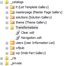
The question is where the hell do i put this? and being a consultant I'll give you the Out-of-the-Box response "We'll that depends" (smug look on my face)... seriously though it depends on your users, do you want just anyone to be able to open it up? in that case toss it into a Transformations library much like you would with CSS or JavaScript, but if you want to obstruct it a little bit create a Transformations folder in you _catalogs folder through SharePoint Designer.  

with that complete go back to your webpart and hit edit, then under the Miscellaneous category fill in the following for the XSL Link: /_catalogs/Transformations/Clear.xslt as shown below.

now once you hit ok or apply this will strip out the standard xslt to expose the raw xml data behind it.

not very interesting but at least you get the point, we're just dealing with xml that's transformed to look like something else.

So let's talk a little about XSLT, firstly here is a great explanation of what it is. Now my one line description is: xslt is an instruction set to transform xml into something else, usually html.

so lets get started, first we'll set up our xslt stylesheet

<?xml version="1.0" encoding="UTF-8"?>
<xsl:stylesheet version="1.0" xmlns:xsl="http://www.w3.org/1999/XSL/Transform" xmlns:ddwrt2="urn:frontpage:internal">
<xsl:template match="/" xmlns:x="http://www.w3.org/2001/XMLSchema" xmlns:ddwrt="http://schemas.microsoft.com/WebParts/v2/DataView/runtime">
<xsl:variable name="Rows" select="/dsQueryResponse/Rows/Row" />

  </xsl:template>
</xsl:stylesheet>

Think of this as our base starting point, for SharePoint, take a look at the highlighted line, we set that up so that when we iterate over our xml items we can just refer to it with the $Rows variable as show below

<?xml version="1.0" encoding="UTF-8"?>

<xsl:stylesheet version="1.0" xmlns:xsl="http://www.w3.org/1999/XSL/Transform" xmlns:ddwrt2="urn:frontpage:internal">
<xsl:template match="/" xmlns:x="http://www.w3.org/2001/XMLSchema" xmlns:ddwrt="http://schemas.microsoft.com/WebParts/v2/DataView/runtime">
<xsl:variable name="Rows" select="/dsQueryResponse/Rows/Row" />
  <html>
    <head>
  <link rel="stylesheet" type="text/css" href="/Style%20Library/ctp/TopPageNavigation/ctp.TopPageNavigation.css"/>    
    </head>
    
    <body>
      <ul id="ctp-topNav">
  <xsl:for-each select="$Rows">
  <xsl:call-template name="ListItem" />  
  </xsl:for-each>
      </ul>
  </body>
    </html>
  </xsl:template>
 
  <xsl:template name="ListItem">
  <xsl:if test="@ParentId = ''">
  <li data-activecolor="{@HexCode}" onmouseout="ctp.TopNav.stripColor(this);" onmouseover="ctp.TopNav.changeColor(this,'{@HexCode}');">
<a href="{@DestinationUrl}">
<span>
  <xsl:value-of select="@Title" />
  </span>
  </a>
  </li>
  </xsl:if>
  </xsl:template>
</xsl:stylesheet>


now the template concept, we'll you can think of it as function of sorts. if this doesn't make too much sense no worries, i'm going to follow this up with much more detailed explanations and examples of xslt.